

MooneyGo IBM Italia
MooneyGo is Italy’s leading integrated mobility platform: over 2 million users, 5,000 municipalities covered, and services ranging from parking and toll payments to trains and local public transport.
The challenge was to analyze the current app experience, identify the main pain points, and define a redesign concept for the Homepage, Category Page, and Detail Page while respecting the brand’s visual guidelines.

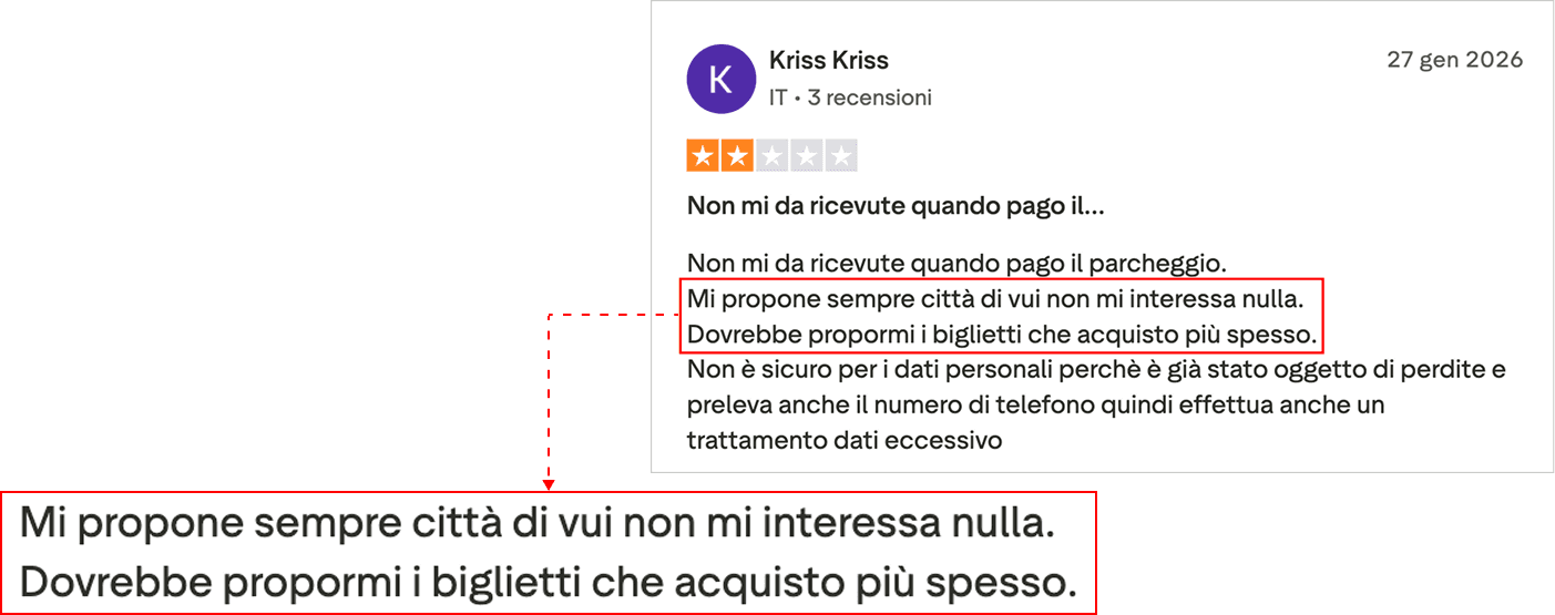
lack of personalization
The app surfaces irrelevant content regardless of user habits, with no memory of recurring actions.

insufficient notifications and system feedback
Users are not warned in critical situations, such as insufficient balance before starting parking, leading to direct consequences like fines.
complicated payment management
Updating a payment method requires a non-intuitive flow, while expired cards are not proactively flagged.


no real-time visibility of history and charges
Unlike direct competitors, toll charges cannot be viewed before invoicing.
fragmented information architecture
Everyday services like parking are given the same visual weight as rarely used services, increasing cognitive load and disorientation.

approach
The analysis started from two parallel sources: a heuristic evaluation of the existing app and direct voice-of-customer research through Trustpilot reviews.
The heuristic analysis confirmed the same patterns emerging from reviews: weak visual hierarchy, inconsistent language across sections, insufficient system feedback, and limited user control in high-urgency scenarios.


personas
I defined four personas to map the variety of usage contexts, frequencies, urgency levels, and error tolerance across MooneyGo’s user base.
Anna became the primary persona for this concept because she represents the most frequent and high-urgency use case, the scenario where friction and lack of feedback have the most immediate and measurable impact on the experience.



decision-first mobility
The core insight that emerged from the analysis was: MooneyGo treats every user as if they were opening the app for the first time every single time.
The proposed concept transforms the app into a mobility assistant that learns from user behavior, anticipates intentions, and reduces decision-making effort during high-urgency moments.
The redesign concept is called Decision-first mobility with the intention of shifting the paradigm from feature listing to active goal support.



key solutions
The Decision-first mobility concept materializes through three redesigned screens: Homepage, Category, and Detail. Every interface choice directly addresses a specific pain point identified during the analysis.
homepage
The current homepage presents a static catalog identical for every user, organized by service type and disconnected from past behavior.
The redesign introduces an adaptive homepage with three contextual states:
Routine state
In the morning, Anna immediately sees a summary of her routine: yesterday’s parking session, her usual train ticket with real-time schedule and status, and two primary CTAs for the most likely tasks. Zero navigation, zero configuration.

Active-service state
When parking is active, the homepage transforms into a control panel: service status remains constantly visible, remaining time is highlighted with an alert indicator, and management actions become the primary focus.
The risk of fines caused by insufficient balance, the most critical pain point emerging from reviews, is addressed proactively through persistent visibility of system status.

Neutral state
For new or non-routine users, the homepage maintains full access to the service catalogue with visible search and quick FAQ access, supporting users like Lara and occasional users.
category
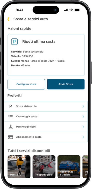
The current category page lists all sub-services with equal visual weight, forcing users to scan the entire list to find what they need.
The redesign introduces a three-level hierarchy:
quick action first
The “Repeat last parking session” section automatically pre-fills all parameters from the previous session: vehicle, zone, duration, and payment method. Users can start immediately or edit a single parameter. From 4 interactions down to 2.
favourites
The user’s most frequently used services appear in a dedicated section above the full catalogue. Visual hierarchy now reflects real usage hierarchy.
full access
All available services remain accessible in the lower section, preserving discoverability without sacrificing efficiency for habitual users.
detail page
The current parking activation screen requires users to select or verify every parameter from scratch at every use, even when identical to the previous session.
The redesign reverses the logic: instead of filling out an empty form, users are presented with a pre-filled summary to confirm or edit selectively.

pre-filled summary
Zone, vehicle, and payment method are already populated using data from the previous session or from the location. Every field remains editable with one tap, but no interaction is required when the information is correct.
circular timer
Parking duration is visualized preserving the circular countdown timer with a clearly visible expiration time. The visual metaphor of an emptying circle communicates time progression instantly and intuitively, reducing anxiety without requiring active reading of numerical information.
single primary cta
Only one possible action above the fold: Start Parking. No ambiguity and reduced risk of accidental taps during rushed or distracted situations.
measurable impact
The redesign was not user-tested during the challenge phase, but every design decision was built to be measurable.
I defined the KPIs I would monitor during validation to establish a direct relationship between identified pain points and measurable outcomes.
KPIs for validation
The most immediate and quantifiable improvement: the parking activation flow decreases from 4 interactions in the current experience to 2 in the redesign thanks to automatic pre-filled parameters. A direct reduction in task time and abandonment risk during high-urgency moments.
key learnings
Every project teaches something that never appears in the mockups. These are the three lessons I would carry into a second phase.
test the most critical pain point first
Insufficient notifications, the issue that causes real fines for users, is both the most urgent problem and paradoxically the least visible part of the redesign.
In a validation phase, I would start there: specifically testing the perception of active parking status and the readability of critical alerts before validating any additional feature.
The perceived damage of an avoidable fine outweighs any convenience improvement.
the risk of predictive patterns
An interface that anticipates user intentions is powerful, but introduces a specific risk: if the prediction is wrong, users must correct instead of configure.
Correcting an incorrect pre-filled state is cognitively more frustrating than starting from scratch.
I would have tested tolerance thresholds for predictive errors before finalizing the behavioral shortcut logic.
Lara as an accessibility stress test
The elderly and occasional persona was included in the analysis but did not receive a dedicated use case in the redesign.
In a real project, Lara would become the primary stress test for every interface decision: if a flow works for her, readable copy, clear hierarchy, no ambiguous patterns, it works for everyone.
Accessibility is the measure of design quality.